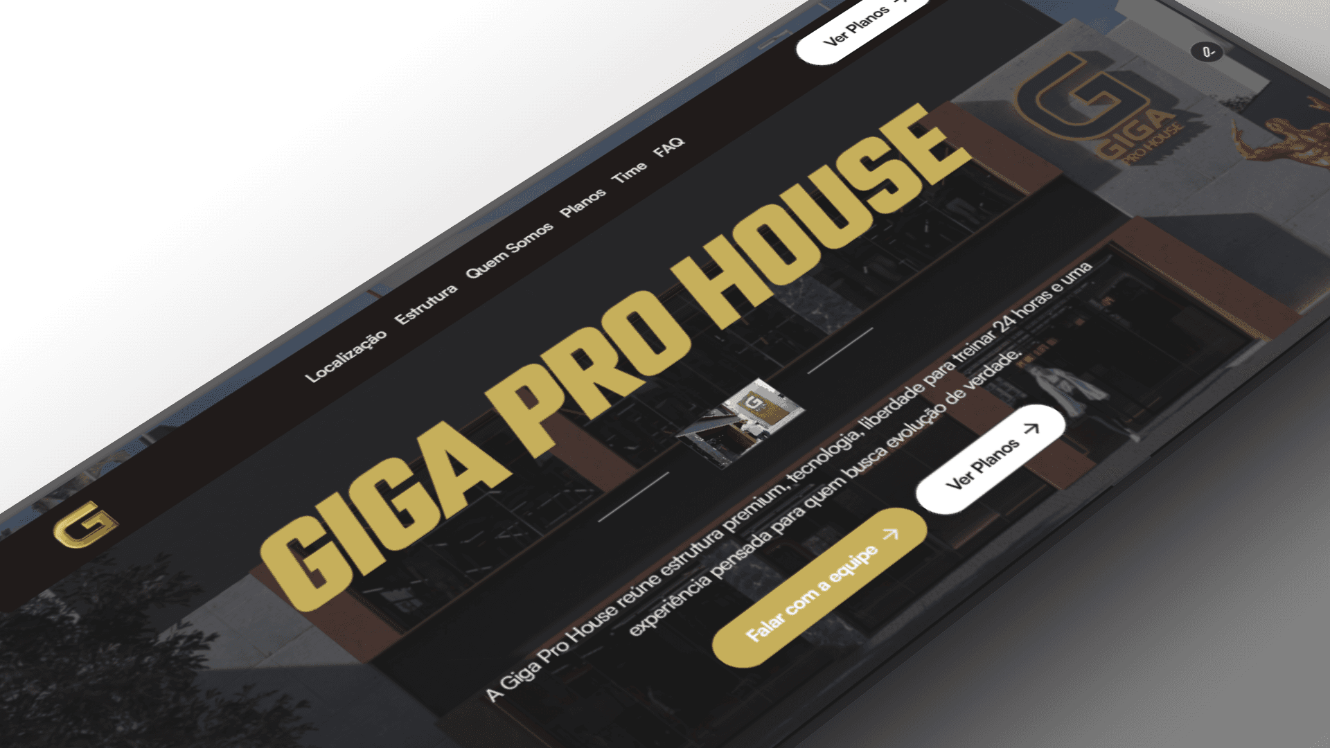
This is a redesign concept for Giga Pro House, a professional gym / academy website focused on class schedules, trainer profiles, membership plans, and community events. It is a speculative project created to showcase UI/UX improvements and interaction design; it is not the official site of Giga Pro House.
Project Overview
The redesign aims to modernize the brand’s online presence by simplifying navigation, clarifying membership offerings, and highlighting trainers and classes. Key goals included improving mobile-first usability, increasing clarity of conversion paths (trial sign-up and membership purchase), and enhancing visual hierarchy to make class schedules and trainer bios more discoverable.
Role & Responsibilities
Lead UX/UI designer: defined information architecture, visual design system, and interaction patterns.
Conducted competitor analysis and heuristic review to identify usability gaps.
Created wireframes, high-fidelity mockups, and interactive prototypes.
Produced responsive designs for desktop, tablet, and phone breakpoints.
Delivered an annotated handoff package (components, style tokens, and interaction specs) for developers.
Workflow
Discovery: stakeholder brief, goals, and audience definition.
Research: competitor benchmarking and quick usability audit of the current site.
Ideation: low-fidelity wireframes and user flows to map key tasks (find class, book trial).
Design: high-fidelity screens, component library, and accessible typography/colors.
Prototyping: interactive prototype built in Framer to validate navigation and microinteractions.
Handoff: documented specs, assets, and component tokens for dev implementation.
Validation: basic usability testing with 5 users and iteration based on feedback